I will start by looking at Parr, and will return to Eggleston in a future post. In the interests of respecting copyright, I will not insert copies of their images here - instead, I will provide links to them where required.
Martin Parr
Parr is a British documentary photographer. Wikipedia states that "He is known for his photographic projects that take a critical look at modern society, specifically consumerism, foreign travel and tourism, motoring, family and relationships, and food.". His main website is here. A general Google search pulls up a variety of his images. As soon as I saw them onscreen, I recognised him as being the author of the book 'The Last Resort', which I read some time ago.
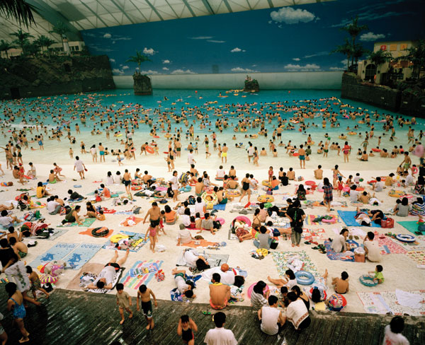
From the thumbnails presented by Google, the one that caught my eye first was 'Ocean Dome', taken in 1996. The colours and huge amount of activity in this image piqued my interest straight away. I'd love to see a large print of this - I can imagine looking at it for ages without getting bored! There are so many people doing different activities, and what an interesting setting too.
I love the way that the turquoise / blue of the water contrasts with the skin tones of the people swimming and playing. Viewing 'Ocean Dome' at low resolution, it feels to me like a 'painterly' effect, perhaps in the style of Pop Art. Two Pop Artists that I am particularly keen on are James Rizzi and Charles Fazzino. Although their subjects are primarily architectural or abstract, rather than people, their images have the same feeling of 'hustle and bustle' that captures my imagination in 'Ocean Dome'.
To return to the book 'The Last Resort' for a moment - I found the photographs within it interesting, but they also made me feel a little uncomfortable. Parr's images capture the good and the bad in life equally, and his ability to bring out such contrasting emotions in viewers is a testament to his great skill as a photojournalist, in my opinion. Many of the photographs that we see nowadays have been 'Photoshopped' to remove distracting elements, or just to make scenes look a bit 'nicer'. However, Parr's images seem to me to present true 'snapshots' of life, including both good and bad. His photographs often contain humorous elements, but if I look deeper, I start to feel sad, too.
People often look back with nostalgia at their childhood holidays, and memories of seaside holidays have become romanticised in the British imagination. Family albums are often full of snapshots of happy, smiling people on the beach, and postcards showing resorts with perfect blue skies. Often, that's how those holidays become imprinted in the memory - good times, slices of perfect lives. However, Parr's shots take all of the forced poses and faked emotions and brush them aside. Perhaps the people in the photographs are having fun, for instance buying their ice creams in this well-known picture, or eating their fish and chips here. Perhaps they don't notice the squalor of the empty chip wrappers around them, but the viewer of the resulting photograph does!
Perhaps now more than ever, we expect photographs to be artificially perfect, and we feel uncomfortable if that's not the case.
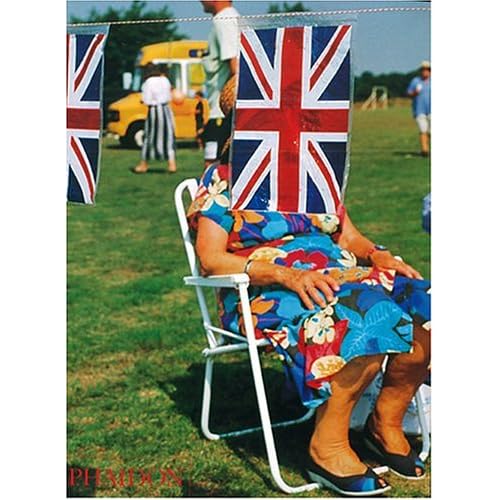
Many of Parr's images, such as this one which adorns the front of the 'Think of England' book, are full of colour - often bright, primary colours. However, do I find them visually appealing because of this? I'm not sure. Parr's photographs fascinate me and although they make me feel uneasy, I can't help but look at them in detail.
Parr is an internationally acclamied professional, who has an uncanny ability to capture the imaginations of those who view his photographs. I, on the other hand, am a struggling amateur, who has not yet developed a particular style of my own. It seems wrong to compare my work with his! Instead, perhaps I'll pick one of my favourite professional landscape photographers - Guy Edwardes - and compare Parr's style with his. They are worlds apart! Parr's images are often jarring, and present snapshots of life in an unforgiving manner. Edwardes' images are soothing and serene. He uses colour to present a perfect sunset or gentle pictures of flowers.
In my opinion (and I recognise that not everyone would agree), both styles are used to represent the photographer's interpretation of reality, and as such are equally valid. I picked Edwardes as my example because his work is a great inspiration to me. If I am ever able to capture the beauty of our coastline to the same degree that he can, I'll feel a huge sense of acheivement. His landscapes capture the sense of peace that I feel when watching a sunset, or looking at a beautiful ocean view. As I've already said, Parr's images fascinate me, and I could look at them for hours. Edwardes' images do too, but the feeling I get when I view a gentle seascape is very different to the emotions I experience when looking at Parr's seaside photographs. I can't imagine ever feeling truly comfortable working with subject matter similar to Parr's.
This emphasises to me something that I was subconsciously aware of anyway - photography can be used for a huge range of different purposes. The subject of the essay for my third assignment will be 'ethics and truth in photography', and I look forward to being able to look at the question of validity in more detail.



No comments:
Post a Comment